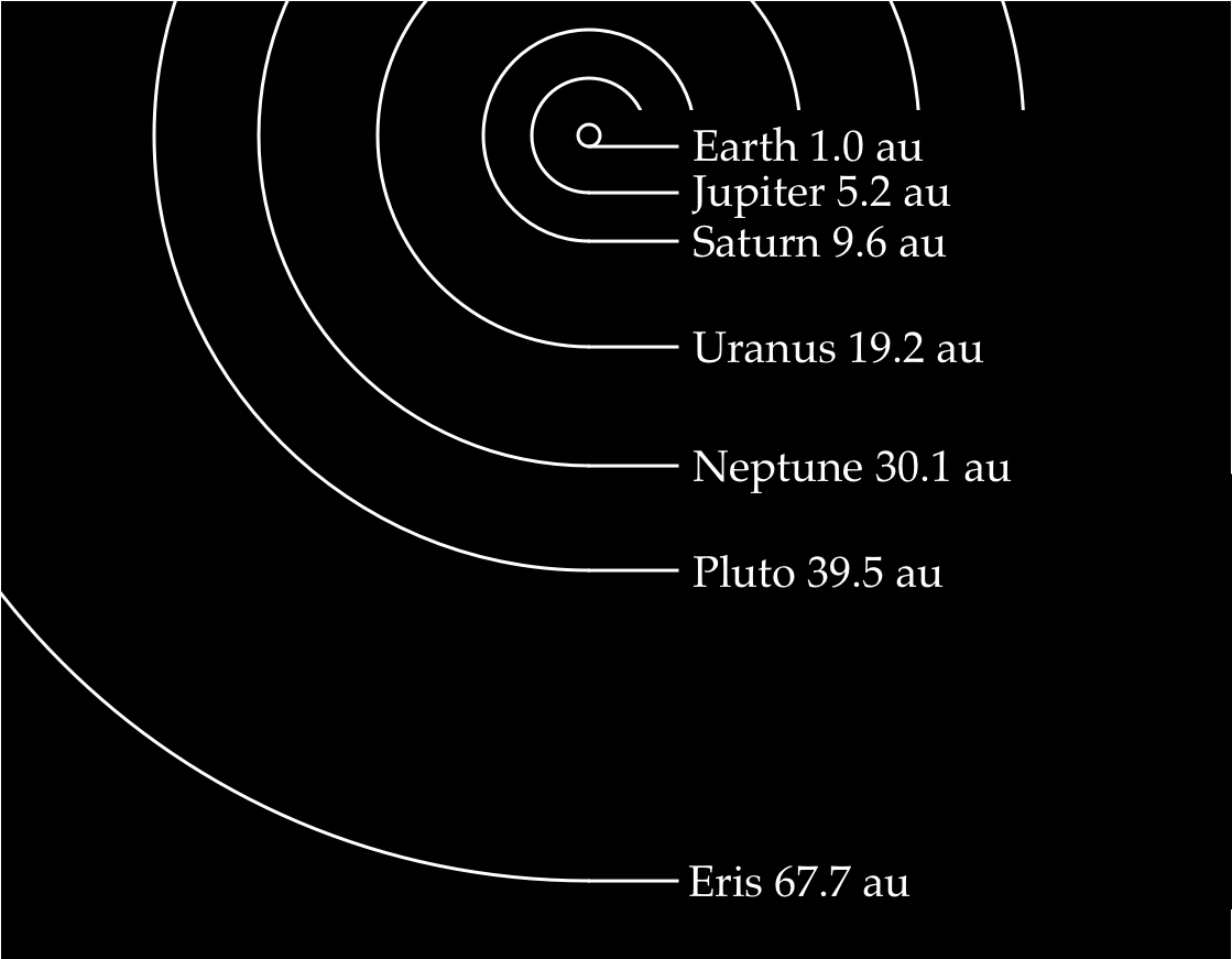
A picture of the Solar System with proportional distances

Figure 1: Solar System with proportional distances.
Understanding Solar System distances
It is hard to grasp the the magnitude of our Solar System because the sizes and distances involved are much bigger than anything we encounter in our everyday life. It is not easy for me to imagine the size of our planet because it is nearly 3 million times bigger than my body. When I try to visualize the distance from Earth to Mars, which is 78 million times bigger than my route to the post office, my brain says “You’ve got to be kidding me!” and starts to ache in protest.
It is quite normal for us to have this disability for appreciating cosmic sizes. After all, our body is the product of natural selection which until very recent times rarely encountered anything closer than a river or a wolf. The machinery for dealing with astronomical units of measurement never evolved in us because it did not give us any survival benefits.
But we shouldn’t give up in our quest to understand the world outside our cave. One way to learn anything is to draw a picture. In the previous post I illustrated the relative sizes of the Solar System objects. Today my focus is to show the distances between them. Figures 1 and 3 illustrate locations of various objects in the Solar System and their distances from the Sun. The distances are expressed in astronomical units abbreviated as au. One astronomical unit is the approximate distance from Earth to the Sun.
Let me explain a bit more about those distances. The title of this post includes the words ‘proportional distances’. This simply means that spaces between objects shown in the picture would be roughly correct if we looked at the real Solar System from a spaceship. For example, we know that planet Neptune is about 30 times farther from the Sun than Earth. Therefore, the picture of Neptune should also be 30 times farther away from the Sun than Earth. This is all I meant by ‘proportional distances’.
Orbits aren’t circles
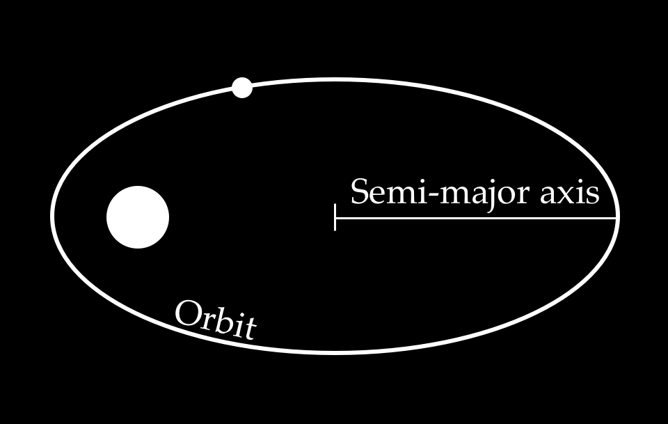
As you probably know the orbits of the planets are not usually circles but rather stretched circles called ellipses. This means that the distance from an object to the Sun changes over time as the object moves along its orbit. One of the standard ways to measure the orbit is to use the length of its semi-major axis. This simply means taking the half of the longest part of the orbit (see Figure 2). This is all the term semi-major axis means and I used it on Figures 1 and 3 to for the distances.

Figure 2: Measuring the size of an orbit.
Beyond Eris
Figures 1 and 3 show the region of the Solar System from the Sun to the dwarf planet Eris. Beyond Eris there are other important objects and regions of the Solar System including termination shock, heliopause and Oort cloud. I decided not to include them into the pictures for two reasons. Firstly, I don’t understand them yet. Secondly, those regions are much further away and drawing them would require much taller pictures.
Data for the distances of the Solar System objects
Table 1 shows the distances from Solar System objects to the Sun. Each distance is the length of the semi-major axis of the object’s orbit. The distances are measured in million kilometers and astronomical units.
| Object name | Distance from the Sun (semi-major axis) | |
|---|---|---|
| Million km | au | |
| Mercury | 57.91 | 0.4 |
| Venus | 108.21 | 0.7 |
| Earth | 149.60 | 1.0 |
| Mars | 227.92 | 1.5 |
| Vesta | 353.36 | 2.4 |
| Ceres | 414.09 | 2.8 |
| Pallas | 414.69 | 2.8 |
| Jupiter | 778.57 | 5.2 |
| Saturn | 1,433.53 | 9.6 |
| Uranus | 2,872.46 | 19.2 |
| Neptune | 4,495.06 | 30.1 |
| Pluto | 5,906.38 | 39.5 |
| Haumea | 6,472.74 | 43.3 |
| Makemake | 6,843.45 | 45.8 |
| Eris | 10,132.11 | 67.7 |
Table 1: Distances from Solar System objects to the Sun.
Detailed view of the Solar System
The Figure 3 shown bellow is a zoomed-in picture of the Solar System that includes more objects than Figure 1.

Figure 3: More detailed picture of the Solar System with proportional distances.
Traveling to Saturn by bus
In conclusion, I would like to present some hypothetical analogies that may help us understand the distances in the Solar System.
- It would take about four thousand years to travel to Saturn by bus at the speed of 40 km/h relative to the Sun.
- If you used an airplane instead it would take roughly 200 years at the speed of 800 km/h.
- Finally, a journey to Saturn would take approximately three years if you managed to board a space probe Voyager 1 traveling at the speed of 60,000 km/h. This is about as fast as humans can move today.
Sources of the distance data
- Mercury: Mercury Fact Sheet, NASA. [link]
- Venus: Venus Fact Sheet, NASA. [link]
- Earth: Earth Fact Sheet, NASA. [link]
- Mars: Mars Fact Sheet, NASA. [link]
- Vesta: JPL Small-Body Database Browser: 4 Vesta, observation date 2013-03-30. [link]
- Ceres: JPL Small-Body Database Browser: 1 Ceres, observation date 2014-07-01. [link]
- Pallas: JPL Small-Body Database Browser: 2 Pallas, observation date 2013-02-20. [link]
- Jupiter: Jupiter Fact Sheet, NASA. [link]
- Saturn: Saturn Fact Sheet, NASA. [link]
- Uranus: Uranus Fact Sheet, NASA. [link]
- Neptune: Neptune Fact Sheet, NASA. [link]
- Pluto: Pluto Fact Sheet, NASA. [link]
- Haumea: JPL Small-Body Database Browser: 136108 Haumea, observation date 2015-11-24. [link]
- Makemake: JPL Small-Body Database Browser: 136472 Makemake, observation date 2015-12-21. [link]
- Eris: JPL Small-Body Database Browser: 136199 Eris, observation date 2015-12-17. [link]
References
- Proportionally sized Solar System objects in natural colors
- Source for the Figure 1 in Sketch format
- Source for the Figure 2 in Sketch format
- Source for the Figure 3 in Sketch format
